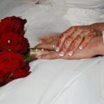
Putting Pantone into Your Wedding Décor
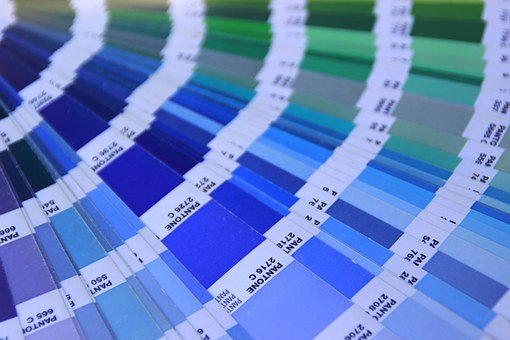
PANTONE 19-4052 Classic Blue
Putting Pantone into Your Wedding Décor.
About the Pantone Colour System
‘Pantone Colour is a colour-matching system universally used by many industries, including printing, graphic design, paint and the make-up industry, amongst others.’
Invented in the early 1960s, the Pantone matching system lets designers achieve colour-matching of specific colours no matter what process produced it. Every colour in the Pantone Matching System has its own unique number (PMS number) and that allows for exact matches every time. Pantone attributed to every colour, in all their tones and tints, a classification number. As this Visme blog says: ‘Pantone literally wrote the book on colour matching. For over 40 years, Pantone has been the go-to colour matching system for not only the design industry but also paint, textile and plastic manufacturers.’
The Pantone Colour of the Year
Back at the turn of the millennium, in 2000, the Pantone Colour Institute created the Pantone Colour of the Year as a trendsetting concept for branding, marketing and creative society as a whole. The introduction of the Pantone Colour of the Year confirmed The Pantone Colour Institute as the front-runner for all things colour related.
So it’s easy to see why and how there is such anticipation and excitement about Pantone’s new colour of the year. It influences everything – including wedding venue décor.
The Pantone Colour for 2020
Below you’ll find our blog about Pantone’s colour for 2020. Although it’s dated now you can still get the idea of how the Pantone colours will influence wedding venue decor. Thus, if you’re planning a wedding and you want to be en trend with putting Pantone into your wedding décor then you need to watch what they’re doing.
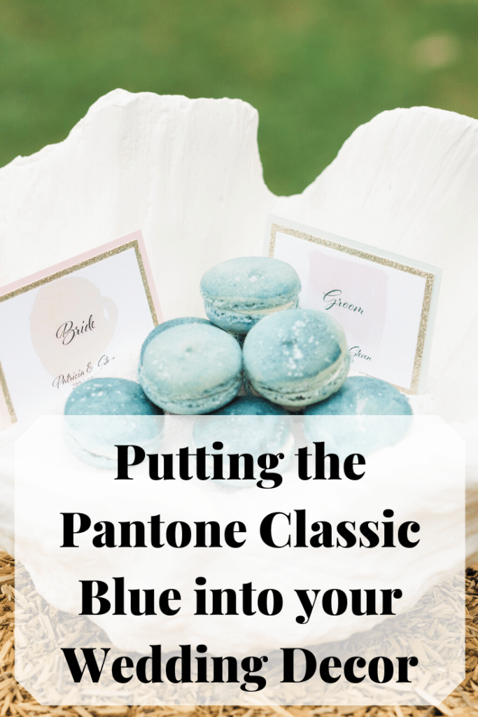
The 2020 Colour of the Year: Pantone 19-4052 Classic Blue
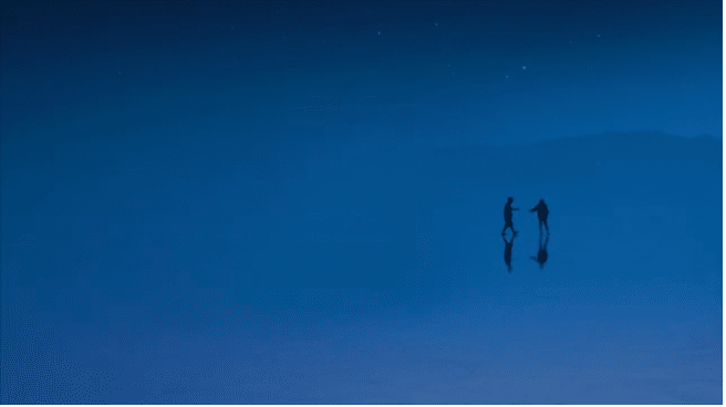
Pantone’s own website describes their 2020 colour of the year as: ‘A timeless and enduring blue hue, PANTONE 19-4052 Classic Blue is elegant in its simplicity’. As they say, the colour is suggestive of the sky at dusk.
They also describe blue as something imprinted in our psyche as a restful colour. A claim supported by this website all about the psychology of colour. The site describes blue as the colour of the mind and one that soothes. Blue affects us mentally whereas red brings about a more physical response. They claim that research often shows blue as a favoured colour across the world.
We’re in turbulent times at the moment, thus Pantone suggests that their classic blue ‘brings a sense of peace and tranquillity to the human spirit, offering refuge.’
See Pantone Classic Blue on YouTube: https://youtu.be/UeTNaba14RI
The wedding websites are ahead of the game of course, and have already written about how to use Pantone Classic Blue in your wedding venue décor.
Here’s a few ideas on how to incorporate blue onto your decor and go about putting Pantone into your wedding décor.
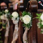
Wedding Florals

Adding blue to your florals works beautifully. You can add as much or as little as you want, flowers provide a wonderful variety of blues for you to choose from. So be as wild or as understated as takes your fancy.
See our wedding flower packages here: https://www.fabulousfunctionsuk.com/4-venue-styling-packages/3-wedding-flower-packages/
Stationery

Add classic blue tones to your stationery then a complementary colour. Here, the addition of gold foil creates a relief effect on these table numbers. Thank you Mat Fox Photography for this fab photo.
Beach Wedding Ideas for Putting Pantone into Your Wedding Décor
- A beach wedding and Classic Blue are a gift for your ‘something blue’.
- Bring blue into your table setting. Blue glassware and blue and white china – either matching sets or mismatched – will nod to Pantone’s 2020 colour of the year.
Your Wedding Cake
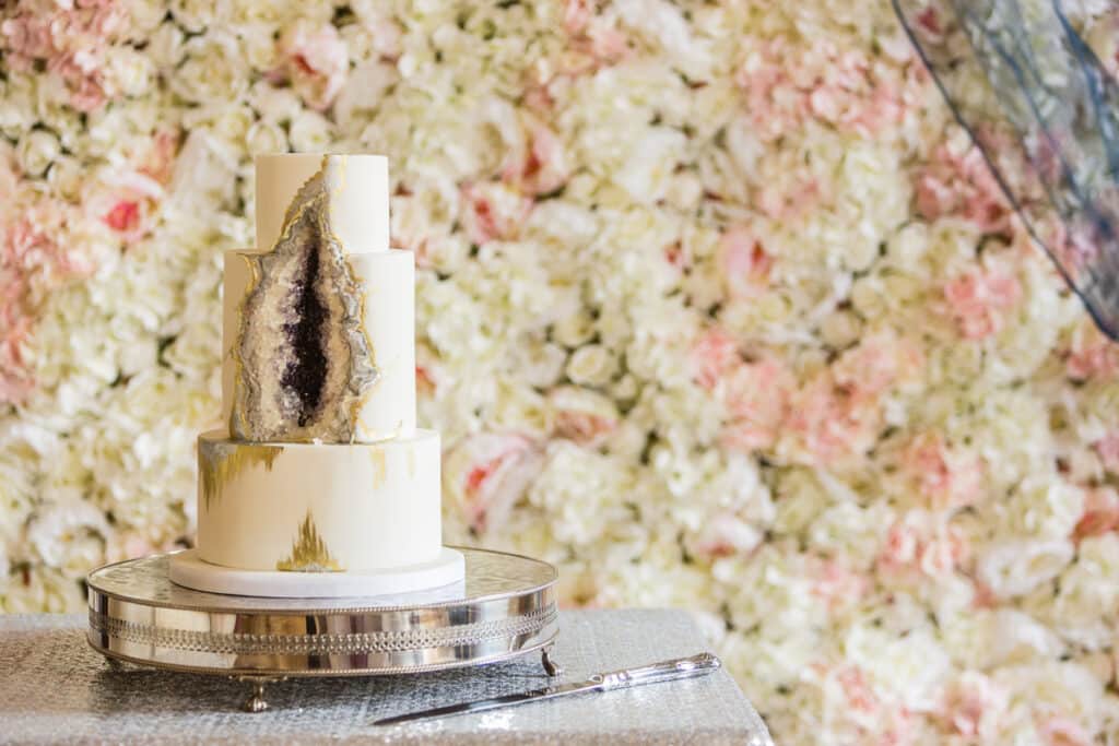
Edible blue – go for a blue geode wedding cake to bring your cake table bang-up-to-date.
Table Settings

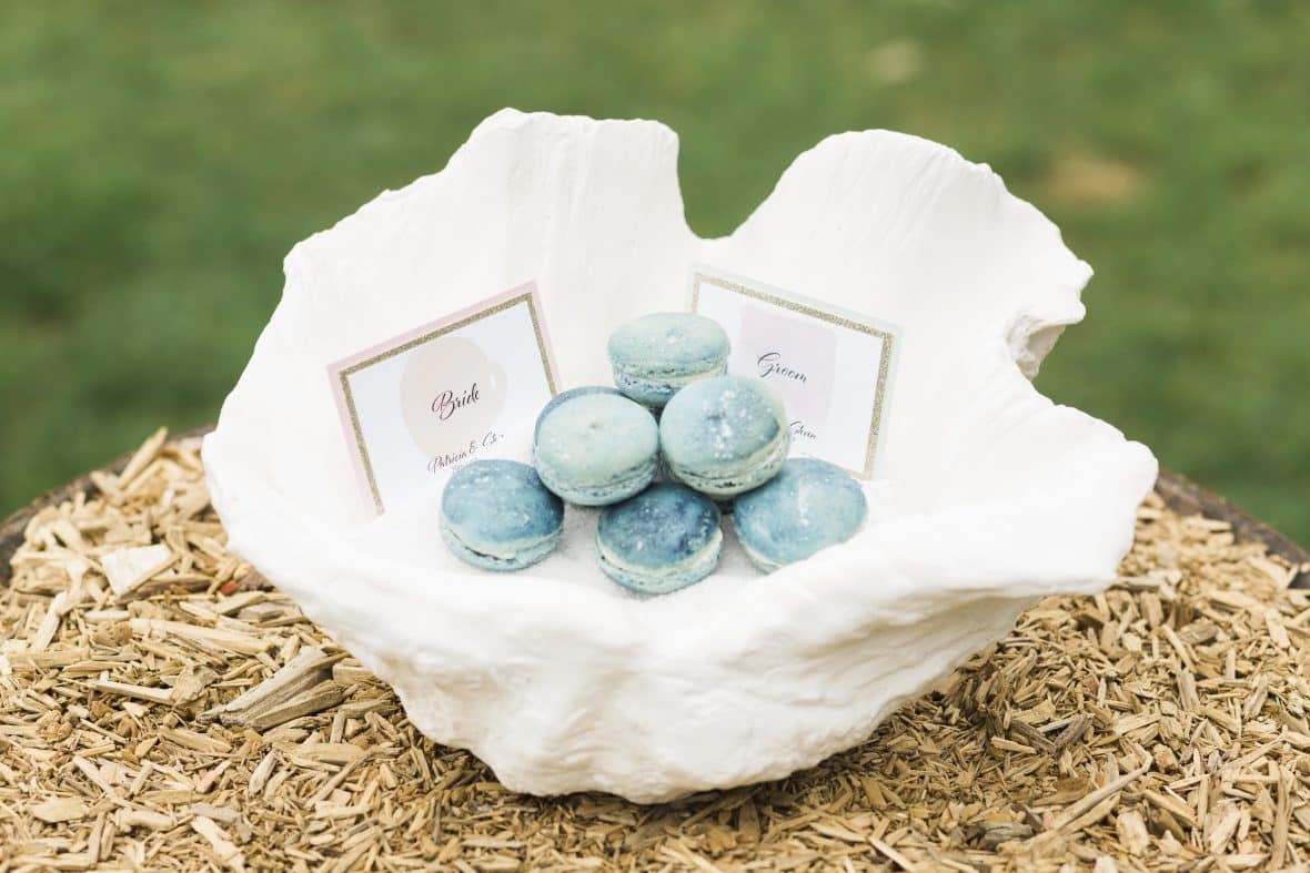
Incorporate blues into your table settings by using napkins in Classic Blue, these blue agate from Fabulous Functions UK slices are the perfect guest name tags and they double up as guest favours too.
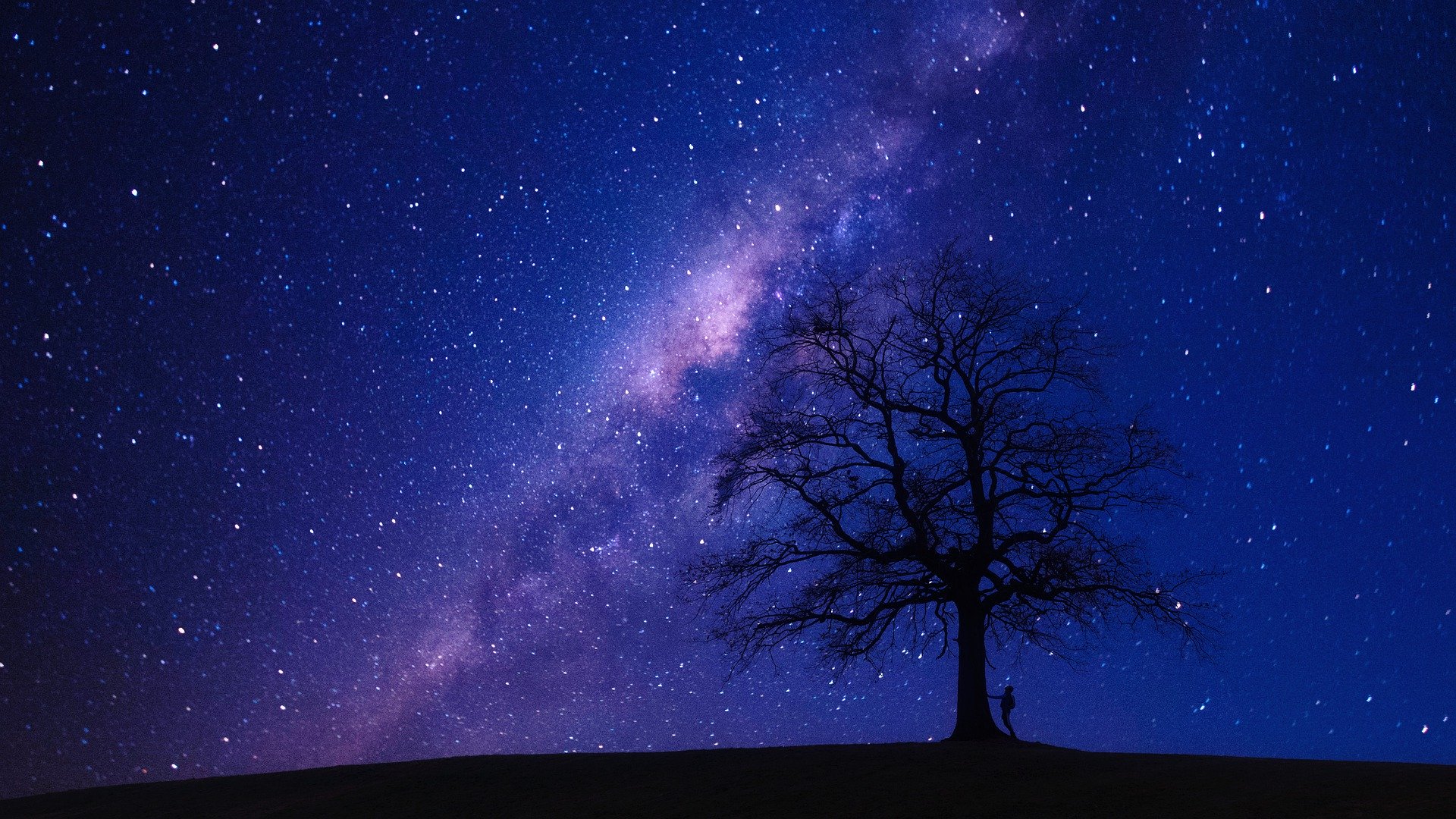
Other ways to add classic blue to your celebrations
- In the summer time when the weather is fine, Classic Blue will look wonderful and fresh paired with white and shots of yellow.
- For a winter wedding though, imagine a celestial-theme. Classic Blue will be heavenly for such a scheme. As will our silver, crushed velvet tablecloths available for you to hire. They’re also available in Royal Blue – which will hint at the trend if not hit it head on.
If by now you’re in love with the idea of a blue-toned wedding but need more ideas – don’t hesitate to get in touch.