Bold Colours in Wedding Décor

Bold colours in wedding décor
I reckon it’s fair to say the colours we’ve tended to use in wedding décor have, of tradition been muted, subtle and classic. So we’re talking about soft pastels, blue and white, or neutral colour palettes. And super beautiful all those tones are.
But what if they’re not you? If you’ve never worn a pastel shade in your life and the idea of them leaves you cold, then consider if bold colours in wedding décor are the way to go. In particular if you want to imbue your wedding with the wow factor! As David Austin says: ‘While we love soft subtle shades and they’ll always have their place in timeless wedding design, bright colours feel fresh, modern and fun. So don’t be afraid to experiment with colour as it can add lots of personality to your wedding day.’
Covid Created a Change
It does seem that the progression out of Covid-19 has wrought a change in weddings. As this Australian site argues: ‘There’s a move towards doing things your way, going bold in your wedding styling, and really pushing the envelope. Bucking the trends like this is a fine line to balance between incorporating the traditions that your family may want you to keep, and injecting your own personality and desires into your most special day.’
Let the Seasons Inspire You
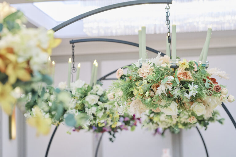
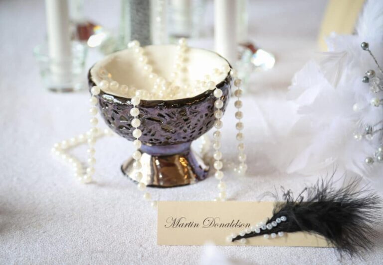
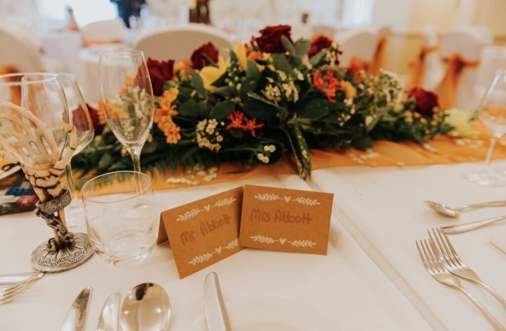
Take inspiration from the season in which you’re getting married. For instance, if your wedding is set for late September through October then autumn is a burnt orange and bronze gift. Or, if you really want to be different, you could go all Hallowe’en. Either full on or with a few spooky accessories like the goblets in this picture below. But of course, if your wedding is in the spring but you love autumn colours then there’s nothing to stop you having an autumn-themed wedding as demonstrated in this blog post.
Not Only Seasons of the Year
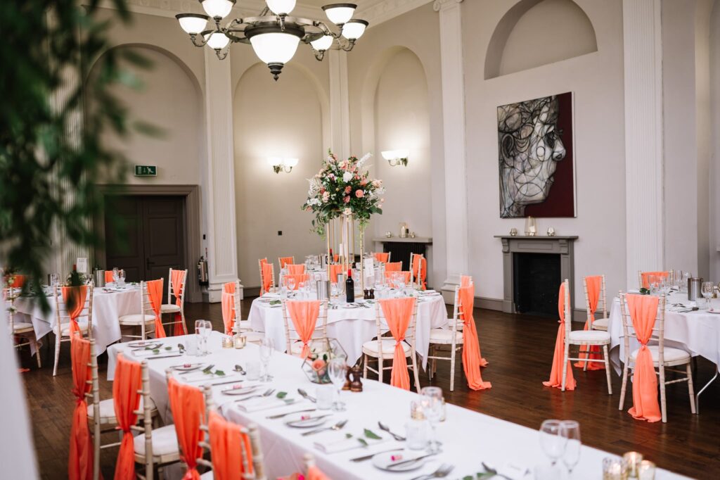
Meanwhile, weddings in the Christmas and Valentine seasons also offer bold colour inspiration and a fab chance to use bright blooms in your bouquet and around the venue. Roses come in all shades of red and pink from a pale bush to a deep wine shade. Add in a little bit of green to set off the reds.
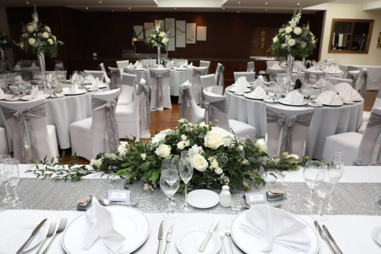
Do Think About Your Venue
It’s helpful, when thinking about your colour scheme, to take your venue into account. What do we mean? Well – if you’re set on a particular colour scheme then it’s likely that a venue with a neutral backdrop will work best. So, we’re talking barn conversions and similar. BUT – if you can be flexible about your colour choices then seek a venue that already has the colours you want, built into its décor in such elements as soft furnishings, walls, carpets, furniture. Even artworks. That will all contribute to a cohesive look.
The 60-30-10 Rule
The 60-30-10 rule is well-known to interior designers. It’s a decorating concept that interior decorators use to pull together a cohesive colour scheme. But of course, there’s nothing to say you can’t apply it to your wedding décor. If you use this decorating rule then your main wedding colour will comprise the 60% and will hold the whole thing together. That could be the bridesmaid’s dresses, the wedding stationery and the focal flower in your bouquet.
Then the 30% of the rule is your secondary colour. For this, think about the mens’ ties, napkins and your bouquet’s supporting flowers, along with centrepieces and any floral installations. And then to tie it all together is the 10% accent colour.
It goes without saying, but we’ll say it anyway, we’re here to help you to follow this rule if you want to – or to break it if you want to. Anything goes!
In Summary
Using bold wedding colours is a beautiful and interesting way to stand out and to take your guests’ breath away. As mentioned earlier, red, the colour of love, romance, and fire, are amazing choices for weddings.

Be Brave in Choosing Bold Colours in Venue Decor
But don’t hold back – pair your main colour choice with other bold colours rather than muted warm tones. That way you can develop a fresh and exciting colour palette.
Other inspiration
Do check out our blog for more wedding theme inspiration beyond bold colours in wedding decor. You’ll find that here.
And of course we’re on social media. There you can see what we’ve been upto and get a further feel for what we do and how we work. Find us on Instagram here and Facebook here. And if you prefer a good old fashioned phone call, you’ll find all our contact details here.